Also featured on Fast.ai.
Big Data Analysis and Network Visualization on Women Harassment Reports
I worked on a network visualization project while attending the summer workshop of a knowledge initiative, KolpoKoushol, designed & run by students and alumni from MIT, Harvard & a few other institutions.
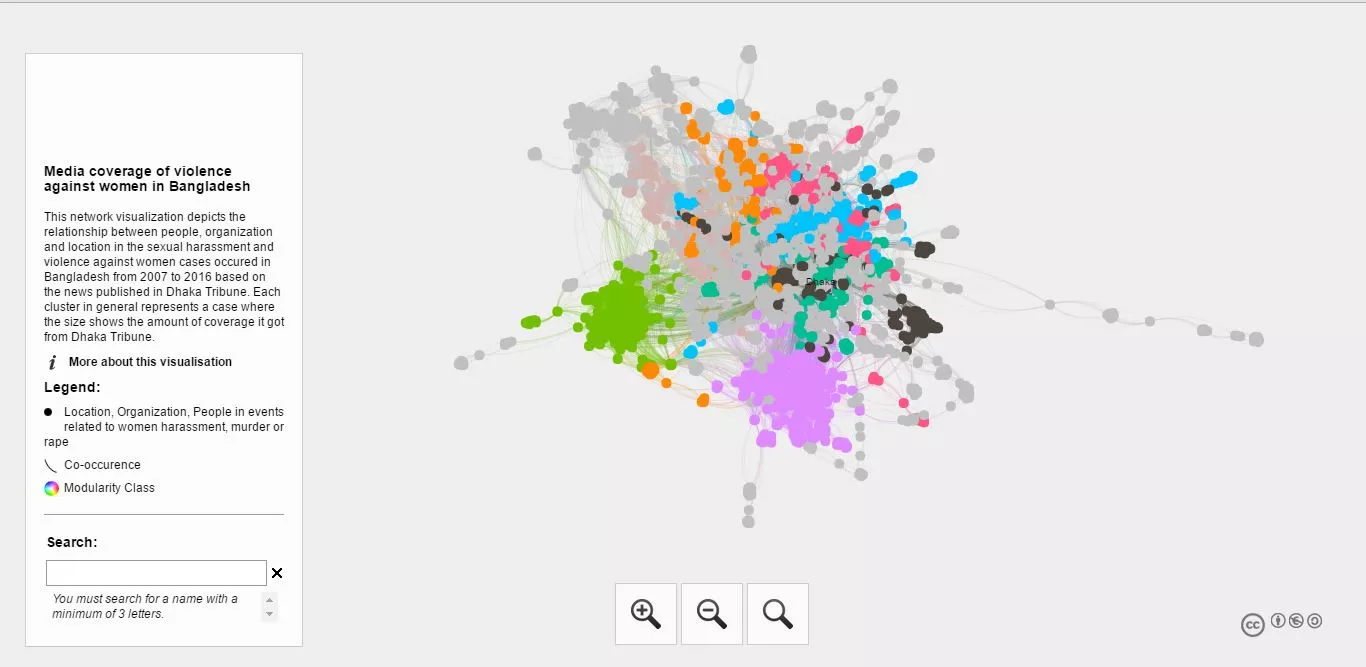
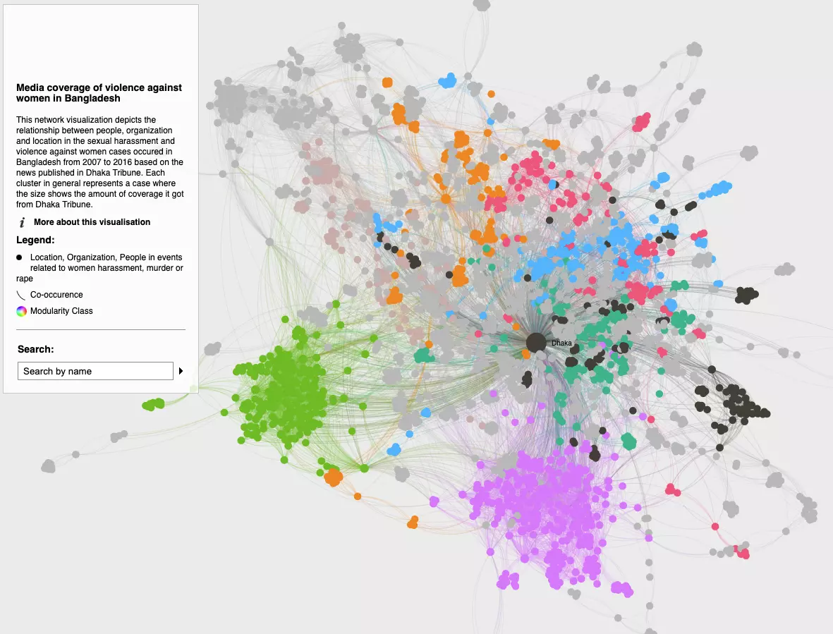
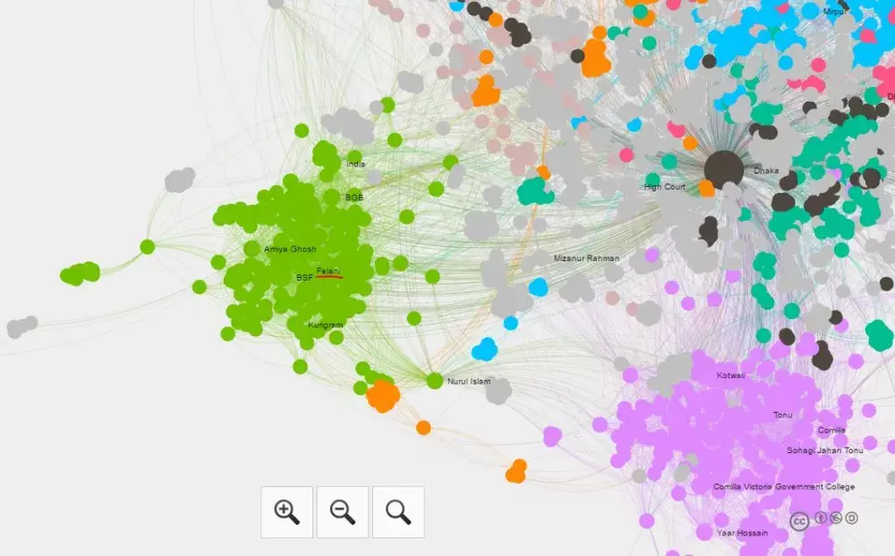
This network visualization depicts the relationship between people & organizations that were involved in several women's harassment incidents. It also binds this relationship diagram with the exact locations where these events occurred. The pictorial presentation is formed from a big data source of over 49000 articles that were published in Dhaka Tribune, one of the most prominent newspapers of Bangladesh, over 4 years starting from 2012 to 2016 on the sexual harassment and violence against women cases. Each cluster in general represents a case where the size shows the amount of coverage it got from Dhaka Tribune.
The team I worked with
The project was instructed/mentored by Syed Arefinul Haque, then Ph.D. student in the Network Science program at Northeastern University. We were a team of four:
- Tahsin Mayeesha
- Arifa S Juthi
- Ananna Farzana
and myself.
Tahsin published a blog on Medium, describing this project and how it explores the media coverage of violence against women harassment.
Technical Details
- Nodes represent the locations, organizations and people who were involved in a specific case of women harassment/violence against women. There is an edge between every two entities if they co-occur in the same article published by Dhaka Tribune.
- The timeline in which the source articles range from 2012 to 2016. The articles acted as the sources of this data interpretation. -At first, the news articles were filtered by specific keywords related to violence against women. The keywords used for filtering are:Acid victims, dowry, women harassment, rape, organization, eve teasing, raped, gang rape, rape case, domestic violence, suicide.
- We got 607 reports from a total of 49055 articles which were used as the data source.
- The news data set were in JSON format. Each news had the attributes as such: news_crawled_date, news_ml_tags, newspaper_url,news_url, news_headline, news_reporters’, news_original_tags, news_text, news_ner_tags, news_publish_date, news_naive_tags, news_image_urls, news_location, newspaper_name, news_keywords, id, is_negative.
- The locations, organizations and people were extracted and analysed from the text by using the attribute news_ner_tags by Stanford NER Tagger. Then they were used as nodes in the network graph.
- The network with 2777 nodes and 21793 edges was exported to Gephi and visualized it. After noticing “Dhaka Tribune” and “Bangladesh” had disproportionate number of edges and knowing they don’t add much to understanding the insight of the topic, those terms were removed from the actual network.
- In the network graph, the edges were created on the event of their co-occurrence in the same article.
- The Network is divided into clusters by the attribute of modularity. Modularity is the degree to which a system’s components may be separated and recombined.
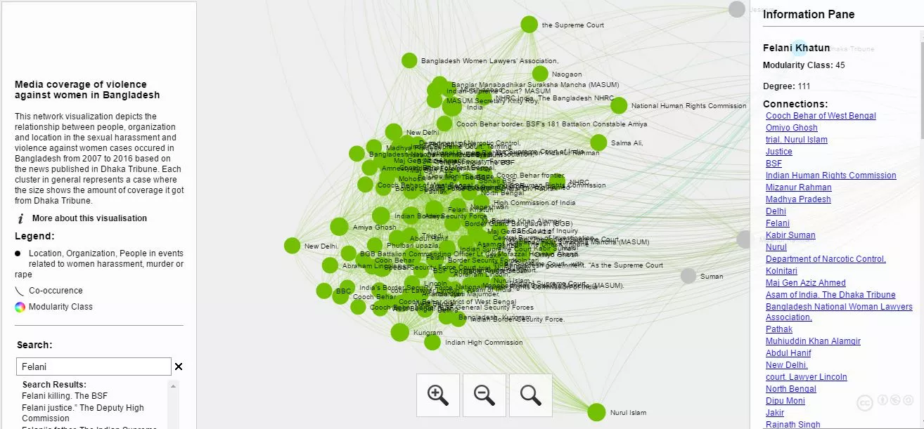
- Thus the clusters actually depict the frequency of the follow ups or the amount of coverage that a particular event received. In this context, for example, we can evidently find out that the news of Felani murder got a great coverage. The green region in the graph marks its coverage frequency.
- We can also see some nodes getting too low responses or adjacent nodes which represents the fact of its low coverage & absence of its regular follow up articles. So it can easily be interpreted that some news about women harassment receive low response & people seem to neglect the articles so much.
The cluster about “Felani Murder” inciden
The people, organizations and location related to Felani incident by searching the name of the event
Tools we used
- Networkx
- Anaconda
- MongoDB
- Github
- Gephi
- Sigma.js
Cool! But where can I see this?
You can visit this link where I hosted network for anyone to explore, licensed under Attribution-NonCommercial-ShareAlike 3.0 Unported (CC BY-NC-SA 3.0)
I've also embedded that down below where you can explore if you're on your laptop. If you're on your phone & having trouble navigating, click the link above.